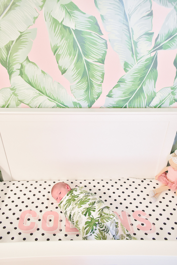
We had already been talking about the idea of moving when I found out I was pregnant with Collins. It was a far off idea and at the time, but time flies and as we welcomed baby #2 into our lives in December, our little 2 bedroom house was still our home. I knew I wanted to create a little space that was hers, but I also knew we didn’t want to do a ton of work (i.e. renovate or add on a full bedroom) since we’d likely be listing the home and moving soon-ish. Poor girl needed something for herself even if she’d be spending A LOT of time in those early months in and around our bed.
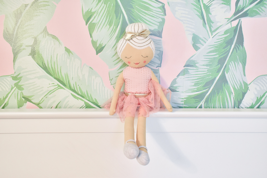
My solution was this: I turned a little nook of our bedroom into her mini nursery. To be honest, it’s really just a wall and the floor in front of it. There’s only enough space for a crib, rug, and few things. It’s very plain, so I thought adding an easy-to-install bold wallpaper would help define her tiny space and add interest for her little eyes.
The Inspiration
Of course you all know I love a good palm print and for me, pink is always a good idea. A vision of palm trees and blush was forming. After browsing endless palm prints, I finally settled on one. This soft pink and light green combo from PB Teen felt like the right color situation. A few I passed on: the famous Beverly Hills Martinique palm with a deeper green and this almost stripey palm print with either white or pink background.
Here’s my mockup.
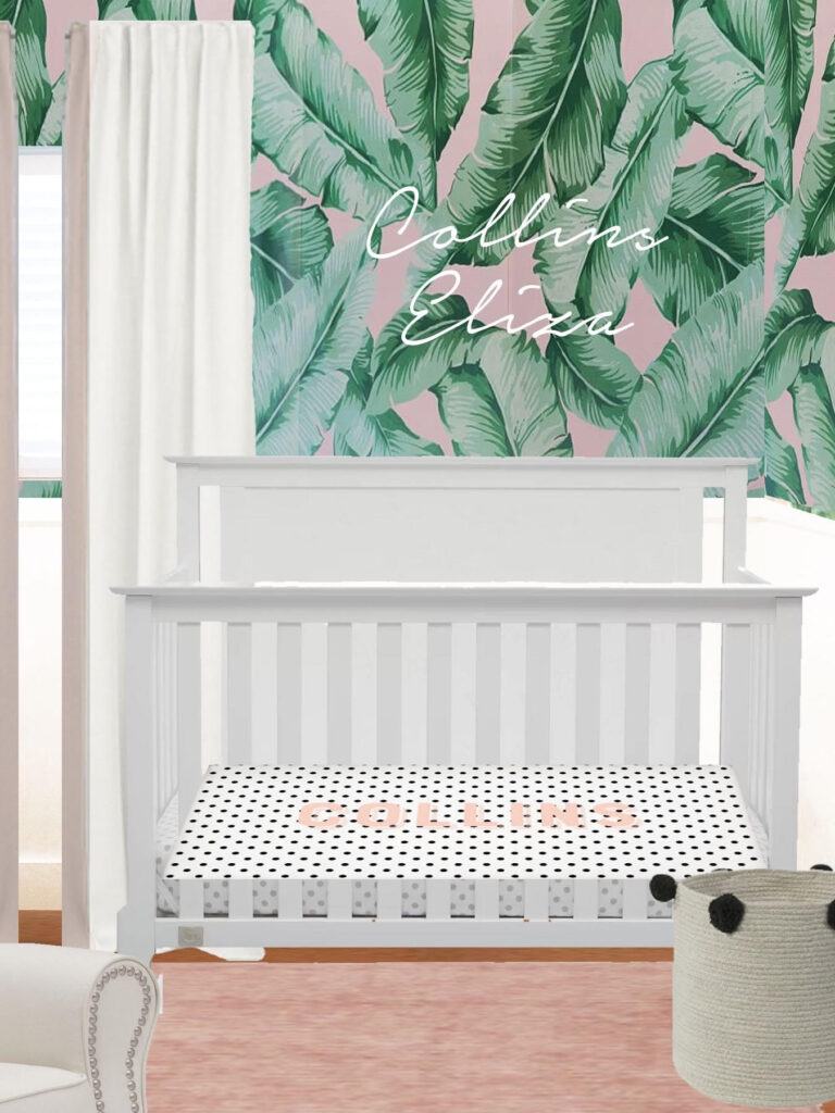
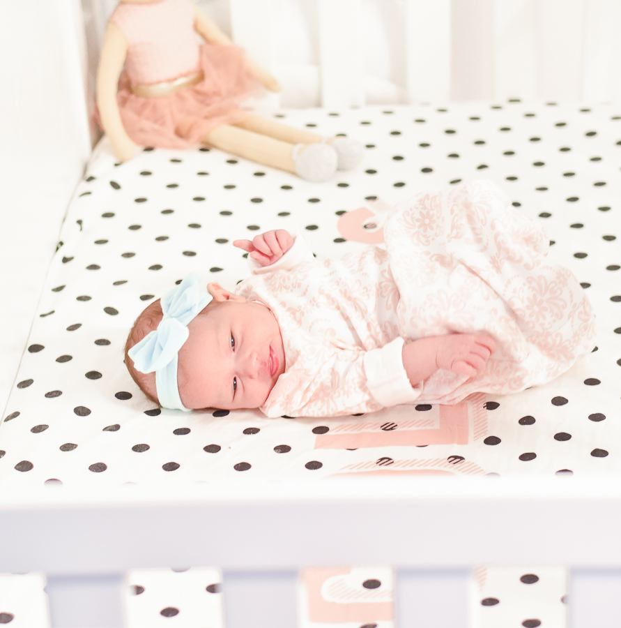
I found an incredible site Carousel Designs that lets you customize crib sheets to your heart’s content. I spent hours and I mean HOURS playing around with so many combinations and possibilities. If you’re like me, that’s a fun way to spend a morning! To balance the organic feel of the palm wallpaper and the pastel tones I eventually decided to go with a contrasting black and white polka dot. I added a large blush pink name print across it and did a coordinating cabana stripe cover for the changing pad. To be honest, I absolutely love it!
For the crib, there are so many styles out there and while I was really tempted to go for a modern version, I ultimately did a traditional style in classic white. This crib from Delta Children is so well made and even holds big sis Emery (who may have tested it out a few times).
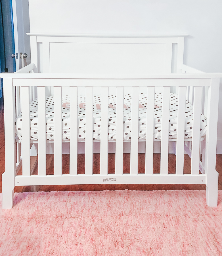
The Finished Look in Action
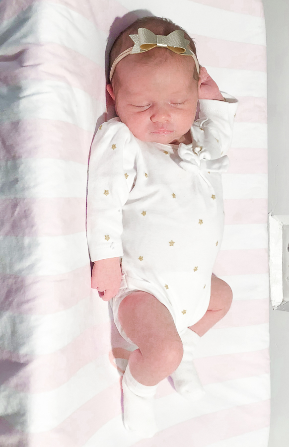
Sweet Collins has already spent so much time here and I love that the space is only steps away from my bed. It’s made this newborn phase that much easier. Plus, how adorable does she look all swaddled and peaceful in her new setup??
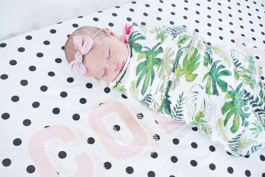
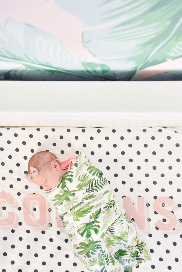
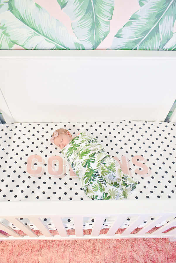
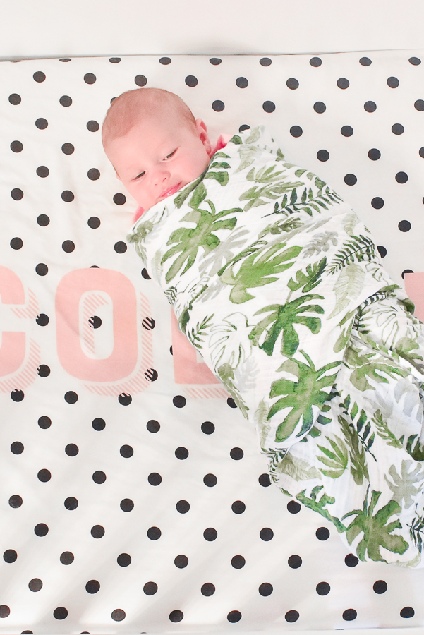
I love poking my head around the corner to see if she’s sleeping. Those chubby cheeks are the best!
Links + Sources
Delta Children crib / Amazon | Newton crib mattress (added this post all about the crib mattress) | PB Teen pink palm wallpaper + similar palm print wallpaper | Lorena Canals rug | Carousel Designs custom crib sheet | Lorena Canals pom pom basket | baby bow by Hazey Baby + love these too | ballerina doll | palm swaddle (they also have a crib sheet and blanket in that print!)
Please let me know if I left anything off or if you have any other questions.

